Occasional graphs
Last updated: Monday 13 May 2024 03:59PM
This page contains graphs that have data with longer lead times or time periods- I want the main page to be a current status page but also want these graphs to be available to people.
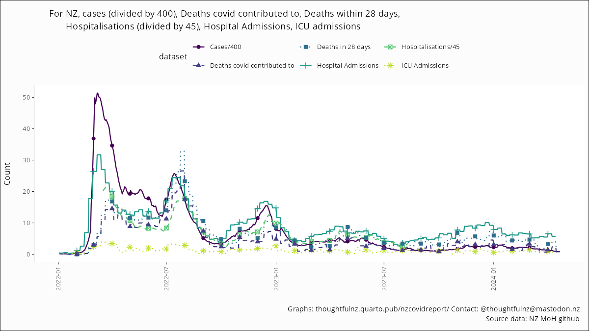
All headline numbers for 2022 on
By dividing the number of cases by 400, and the number of hospitalisations (people in hospital with covid) by 45, I have put all the main figures on one graph.
Reinfections
I have removed the reinfections table as by now, anyone who has had covid can be reinfected, and the reporting changes in August affected the rates. The reinfection rate graph on the main page is still useful for spotting likely variant changes, so that one remains.
Whole pandemic regional totals
I think the regional total cases is most useful for thinking about over case reporting on a regional basis (though this is all pandemic, rather than recent). While this updates whenever the MoH cases information is updated, as a percent of DHB population it clearly doesn’t change much.
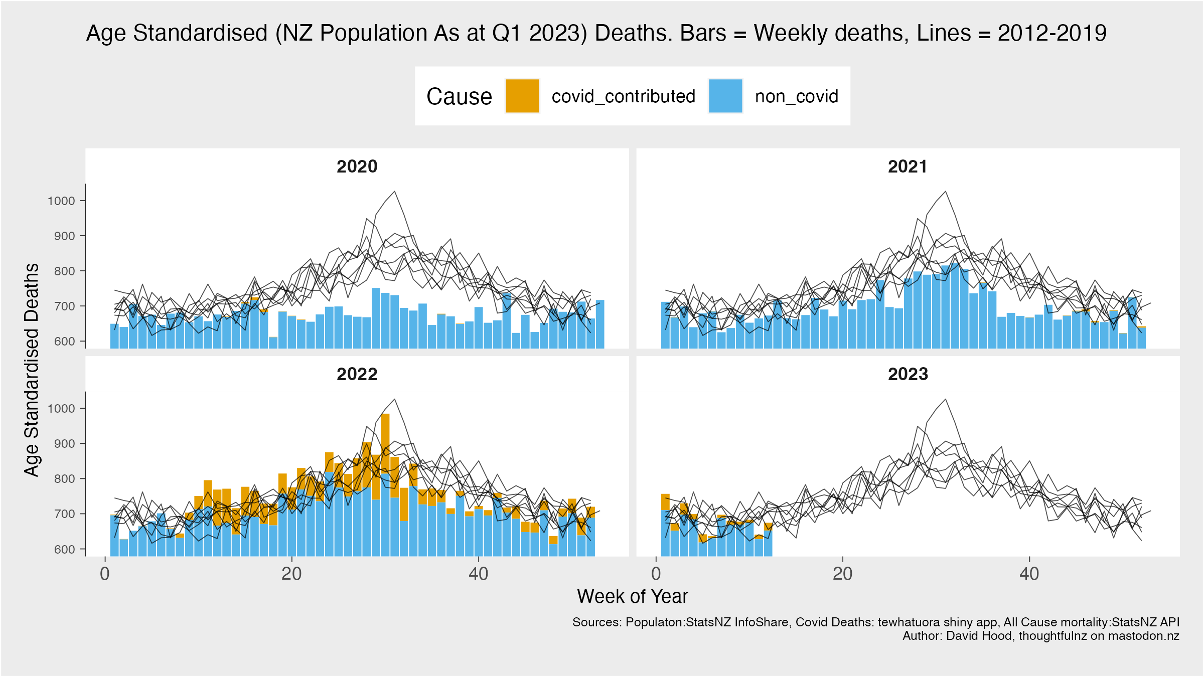
2020-23 all cause weekly mortality
This is weekly mortality since the arrival of nationwide covid in 2022, covid and non-covid. It is age and population standardised to the most recent quarterly population data.
Of the combined data sources, the most lagging is the most recent (quarterly) population to standardise by. So I update this graph when new quarterly population comes out.
This starts at 600 on the vertical axis because age standardised deaths in 2011-19, 2022, or 2023 have never been below that.